Mapping with MACEReports
MACEReports-mapping.RmdMACEReports provides a bunch of functions intended to handle mapping for cruise reports and presentations. These include:
- Creating stickplots
- Creating interpolated maps
- Creating basemaps that use high-resolution bathymetry or simple contour lines
In general, each function is intended to use data that we can readily query out of the database, and not require a ton of work to prepare and map it. You should only need to gather Latitude/Longitude (decimal degrees) and an abundance value (biomass, numbers, etc) in most cases. A dataframe like that provided here as an example:
# get a simple dataset to work from: biomass_nmi2 from a single survey
shelikof_xyz <- shelikof_biomass %>%
  filter(year == 2021) %>%
  group_by(INTERVAL, START_LATITUDE, START_LONGITUDE) %>%
  summarize(
    BIOMASS = sum(BIOMASS),
    BIOMASS_NM2 = sum(BIOMASS_NM2)
  )

knitr::kable(head(shelikof_xyz))| INTERVAL | START_LATITUDE | START_LONGITUDE | BIOMASS | BIOMASS_NM2 |
|---|---|---|---|---|
| 2.02103e+13 | 58.50359 | -152.8091 | 0.000 | 0.000 |
| 2.02103e+13 | 58.50873 | -152.8212 | 5896.876 | 1572.500 |
| 2.02103e+13 | 58.51346 | -152.8341 | 56207.647 | 14988.706 |
| 2.02103e+13 | 58.51815 | -152.8472 | 36888.068 | 9836.818 |
| 2.02103e+13 | 58.52297 | -152.8603 | 22650.779 | 6040.208 |
| 2.02103e+13 | 58.52777 | -152.8733 | 23925.853 | 6380.227 |
provides all the values you’ll need for most functions (well, technically, more: you don’t need the INTERVAL index). Note that this dataframe has all intervals in the Shelkof present, including those that have no pollock (i.e. BIOMASS = 0). This is intentional- you’ll want these if you interpolate values later.
A note about projections
Although these functions generally require Longitude/Latitude (decimal degrees; henceforth referred to as x,y) as arguments, they will re-project points into a nicer projection for producing maps. By default, this is Albers Equal Area Alaska (EPSG:3338). If you’d prefer something else, this is possible (see the help for a given function).
How do I plot these things?
The functions that create sticks and interpolated plots return data in forms that can be plotted however you’d like (base R plotting, ggplot, etc). The Basemaps, however, are ggplot-specific. Examples in this vignette use ggplot for plotting.
Creating sticks
To make a stickplot, you’ll need: x,y, and an abundance value (z).
The function build_sf_sticks will return your sticks as a
sf (simple features) dataframe. sf dataframes
can be plotted easily using ggplot2, or base r
plot.
sticks <- build_sf_sticks(x = shelikof_xyz$START_LONGITUDE, y = shelikof_xyz$START_LATITUDE, z = shelikof_xyz$BIOMASS_NM2)By default, you’ll get a bar that is rotated at 5 degrees from
vertical, and is scaled to work in most plots. These can be specified
differently using the arguments rotation and
bar_scale (see ?build_sf_sticks for details)
Plotting your sticks is easy with ggplot2::geom_sf():
There is a related function to produce a legend to go with your
sticks, build_stick_legend:
stick_legend <- build_stick_legend(stick_data = sticks)By default, it produces a white legend to be placed in the bottom
right corner of the plot, with the proper units for our standard plots
of biomss/nmi-2; all of these defaults can be modified as needed (see
?build_stick_legend). This legend can then be added to you
plot (see below).
Creating a basemap
Of course, what we have so far isn’t a great way to look at your
data! We need a basemap. The function get_basemap_layers
returns a background map that uses either a high-resolution bathymetric
layer that’s appropriate for our surveys, or simple contours at
user-specifed depths (i.e. 100 m, 200 m). It can also return a variety
of commonly used layers including the NMFS management areas, 3 NMI
buffer regions,and Steller Sea Lion exclusions. These basemaps are
intended for the Bering Sea and Gulf of Alaska.
If you just want a basic map, you can simply feed the sticks
dataframe you just created to the function
get_basemap_layers.
basemap <- get_basemap_layers(plot_limits_data = sticks)This will produce land and bathymetric layers that encompass your
data. It returns a ggplot object. If you find yourself
wanting to access these layers without using ggplot
plotting- complain, and we’ll add this functionality.
# plot it all: the basemap, the sticks, and the legend:
basemap +
  geom_sf(data = sticks, color = "red") +
  stick_legend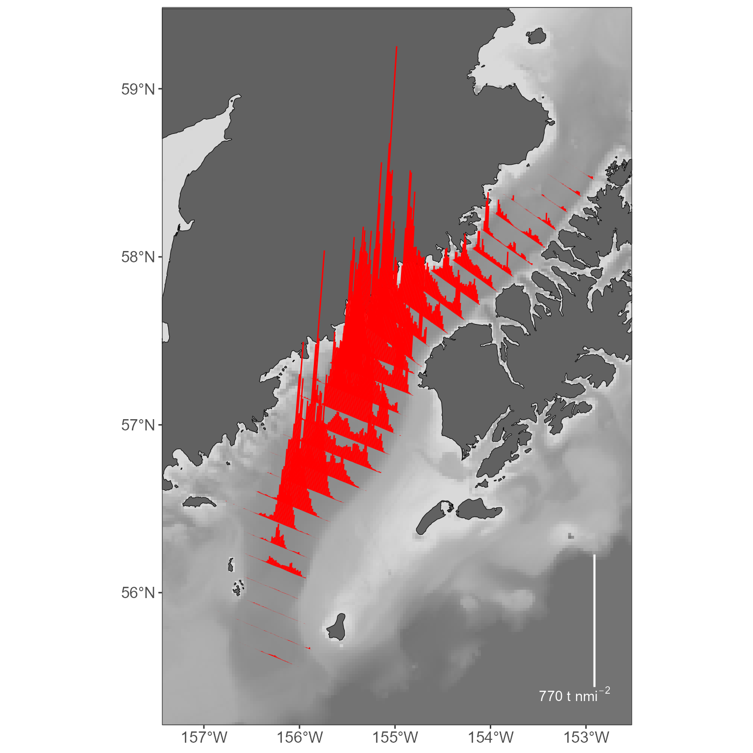
More stickplot options
We often present stickplots with multiple groups (say, small fish and big fish) as separate sticks. This can be done with `build_sf_sticks’:
# summarize the data by fish >=30 cm, <30 cm
shelikof_by_size <- shelikof_biomass %>%
  filter(year == 2021) %>%
  mutate(size_class = ifelse(LENGTH >= 30, "big", "small")) %>%
  group_by(INTERVAL, size_class, START_LATITUDE, START_LONGITUDE) %>%
  summarize(
    BIOMASS = sum(BIOMASS),
    BIOMASS_NM2 = sum(BIOMASS_NM2)
  ) %>%
  # cleanup: because we included intervals with zero pollock, the size class will be NA in those cases.
  # remove those from this plot!
  filter(!is.na(size_class))

# use the 'group_variable' argument in build_sf_sticks to build sticks for each group:
sticks_by_size <- build_sf_sticks(x = shelikof_by_size$START_LONGITUDE, y = shelikof_by_size$START_LATITUDE, z = shelikof_by_size$BIOMASS_NM2, group_variable = shelikof_by_size$size_class)

# plot everything again:
basemap <- get_basemap_layers(plot_limits_data = sticks_by_size)
stick_legend <- build_stick_legend(stick_data = sticks_by_size)

basemap +
  geom_sf(data = sticks_by_size, aes(color = size_class)) +
  stick_legend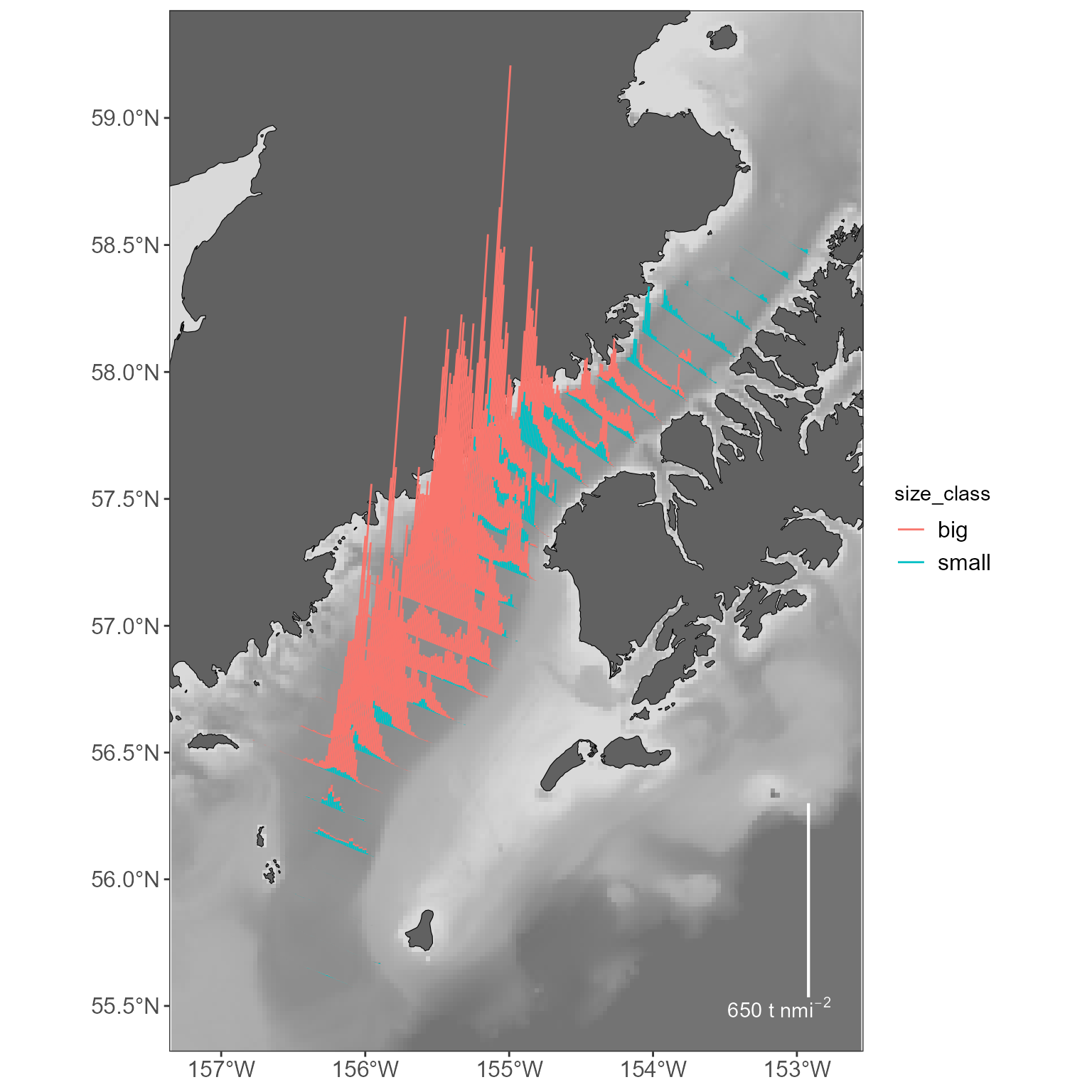
More basemap options
The bathymetry layer is nice for some plots, but inappropriate in others. Want to keep it simple? Specify what contours you’d like to draw. Your options are: 50, 100, 200, 400, 500, 600, 800, 1000 (values are in M). Note that, by default, we don’t add the line types to the legend- these are generally described in figure captions in MACE reports anyway, and the legends get really busy.
basemap <- get_basemap_layers(plot_limits_data = sticks_by_size, bathy = FALSE, contours = c(100, 200, 1000))

# view the plot
basemap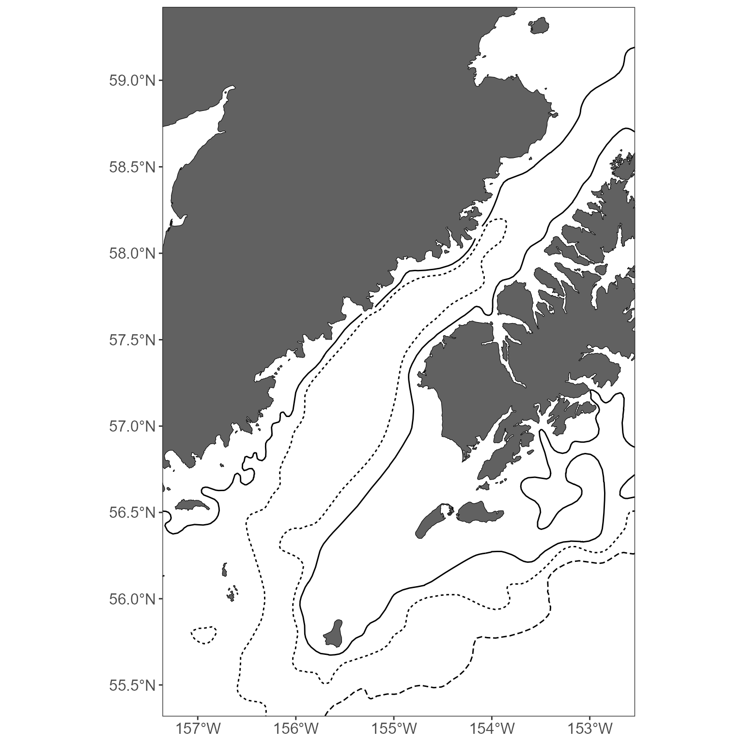
You might also want to include a commonly used layer, such as the
NMFS management area or the 3nmi buffer around land areas. Great. See
?get_basemap_layers for all the current options, but here’s
how you’d add those ones:
basemap <- get_basemap_layers(plot_limits_data = sticks_by_size, management_regions = TRUE, alaska_3nmi_buffer = TRUE)

# view the plot
basemap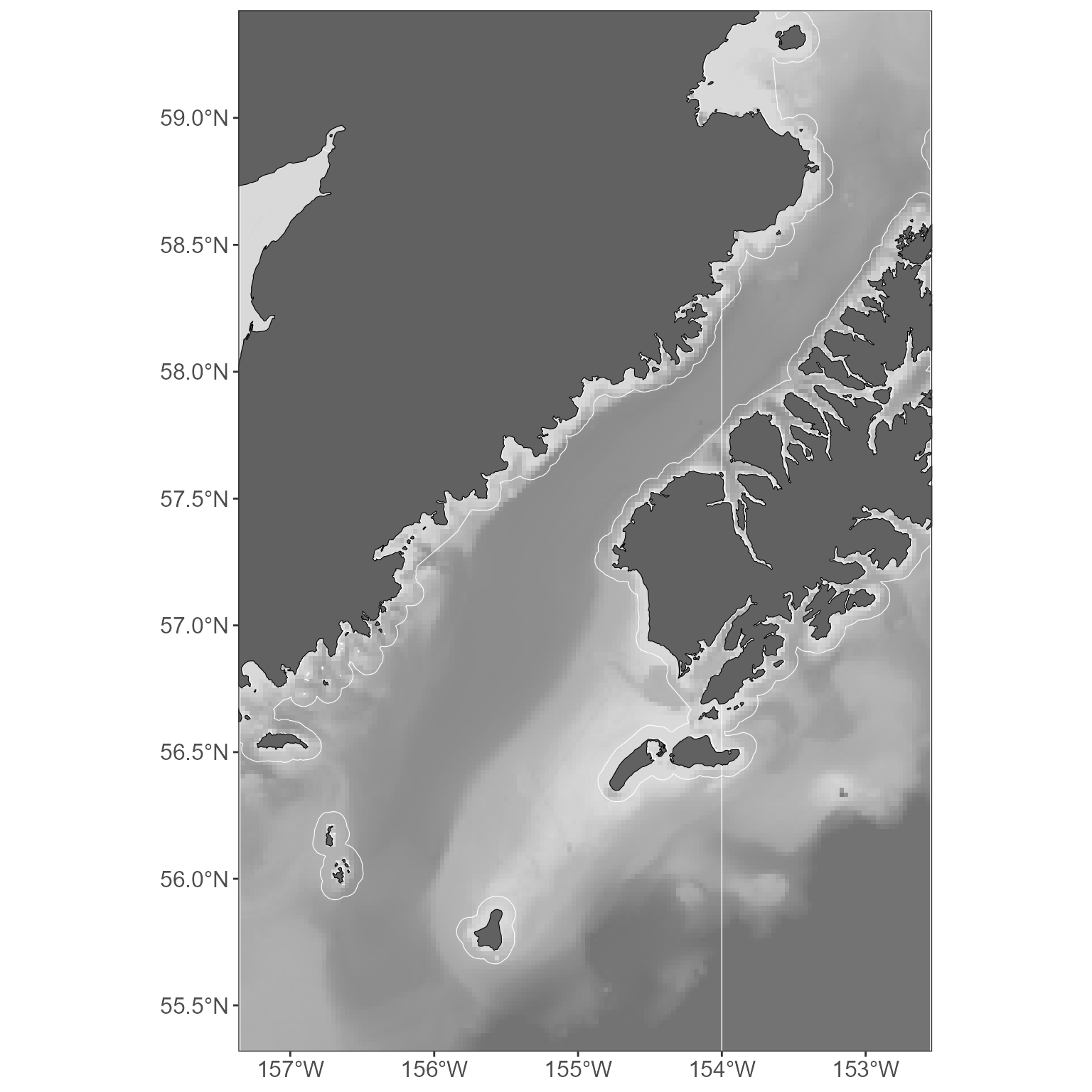
Since the basemap is just a ggplot object, you can add
anything you might want to it, change the themes, etc.
basemap +
  labs(title = "Shelikof") +
  theme(panel.border = element_blank())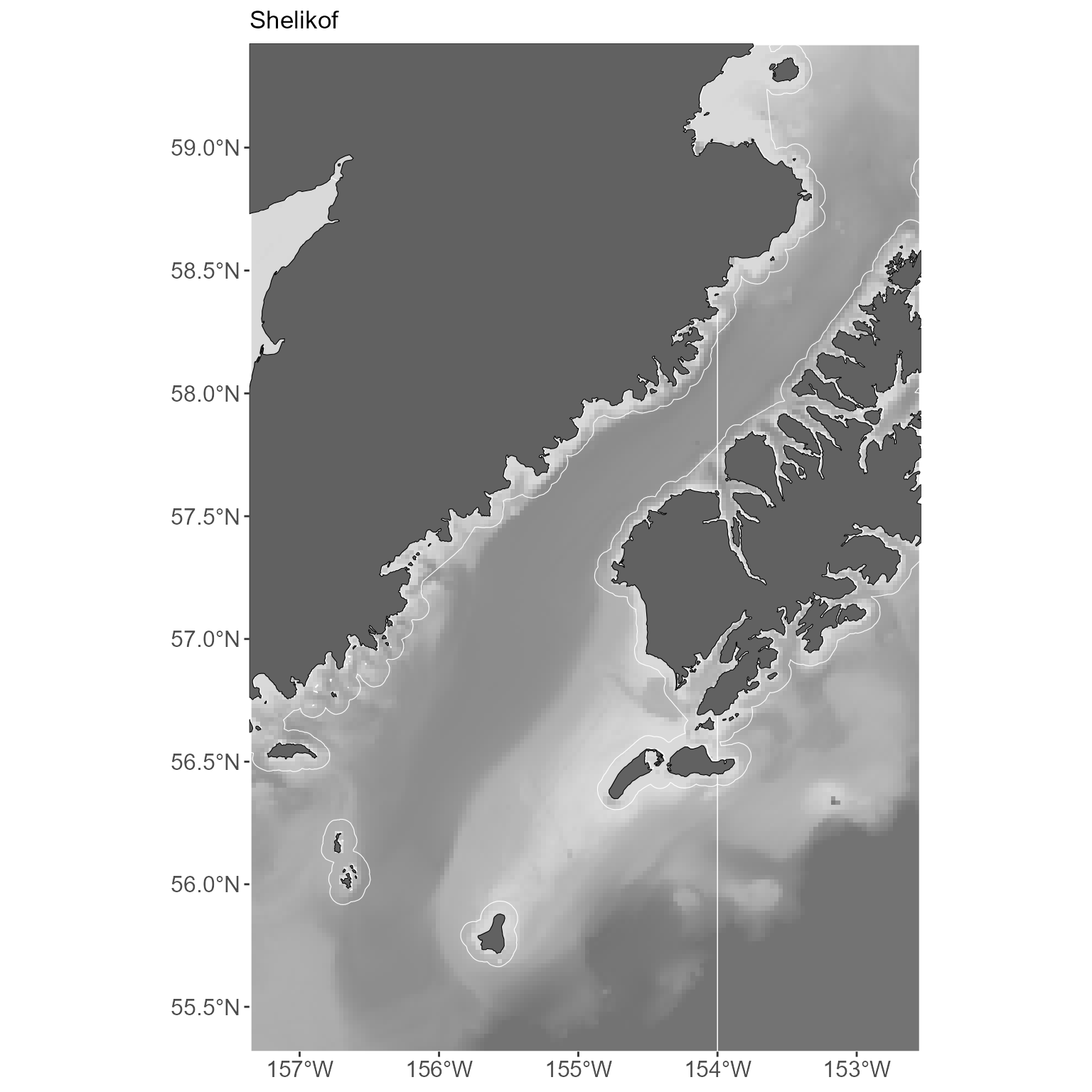
Area labels
We often present an overview figure that identifies all the areas you speak about in some text. MACEReports provides a list of 900 + Alaska area labels, sourced from the NOAA Office of Coast Survey. Want more? Request them! You can view them all alphabetically:
all_labels <- available_labels()

# look at the first few
knitr::kable(head(all_labels))| area_name |
|---|
| Abraham Bay |
| Acheredin Bay |
| Adak Island |
| Adak Strait |
| Adams Seamount |
| Admiralty Bay |
Of course, you probably don’t want 900 labels on your plot.
get_area_labels can be used to return a subset of area
labels appropriate to your plot. Like the basemaps generated with
get_basemap_layers, you’ll need an existing sf
spatial dataframe to specify the limits of your plot.
get_area_labels will then return labels within this
extent.
# generate an sf object for limits- here, we'll use the sticks object for convenience
sticks <- build_sf_sticks(x = shelikof_xyz$START_LONGITUDE, y = shelikof_xyz$START_LATITUDE, z = shelikof_xyz$BIOMASS_NM2)

# use this to return all the labels in this extent
all_labels_in_extent <- get_area_labels(plot_limits_data = sticks)
In this case, you’d still have 135 labels on your plot. It is more
practical to only label the places you talk about in the text. So, go
get all those lined up and add them to a list. We can use this list in
combination with get_area_labels to return only the labels
you care about. You can then plot these labels using
ggplot2::geom_sf_label, ggplot2::geom_sf_text,
or your choice of other sf plotting methods.
# get a list of labels you refer to in the text
goa_labels_to_get <- c(
  "Shumagin Islands", "Alaska Peninsula", "Shelikof Strait",
  "Kodiak Island", "Korovin Island",
  "Cape Igvak"
)

# use this to return only the labels that are both on the list AND within the plot extent
plot_labels <- get_area_labels(plot_limits_data = sticks, area_labels_list = goa_labels_to_get)

# add these to a basemap
basemap <- get_basemap_layers(plot_limits_data = sticks, bathy = FALSE, contours = c(100, 200, 1000))

basemap +
  geom_sf_label(data = plot_labels, aes(label = area_name), alpha = 0.8)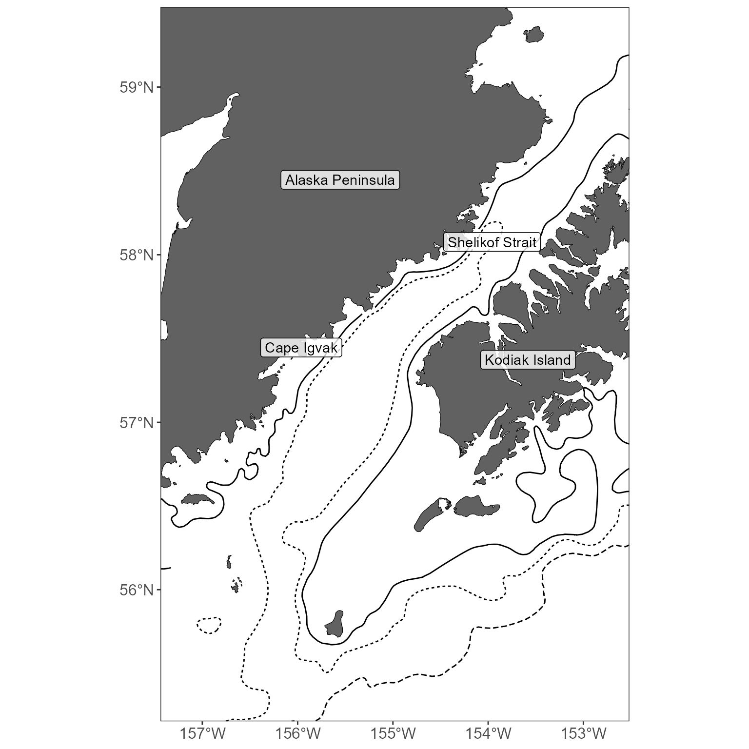
Interpolations
While the sticks are a MACE favorite, it is often nice to present an interpolated map as well. Why might you want to do that?
- Some people think that pseudo 3-d plots like the stickplots are bad (the argument seems to be that they distort the data and are therefore hard to interpret). I don’t totally agree with them, but if you agree, interpolated plots are another option to display distribution and abundance.
- Interpolated plots are a nice way to compare distribution and abundance over time (lots of information in a small panel).
Creating interpolations requires you to make a few more choices as compared to creating stickplots.
There are limitations on where these plots can be made. Right now, you can only make maps in the following regions: ‘shelikof’, ‘summer_goa’, ‘core_ebs’, and ‘sca’ (i.e. Shelikof Strait winter survey, Summer GOA survey, Summer EBS survey, summer EBS survey within the sea lion conservation area). This is because you must define the domain for your interpolation. In practical terms, that means someone needs to build a polygon that defines the domain. If you want to create interpolations elsewhere, we can work to add that polygon here.
You have to define the resolution over which you want to interpolate. Smaller numbers = finer resolution (and slower run times). This value can be thought of as the distance in meters between the interpolation points. 1000 seems to work well in the Shelikof, 2500 seems to be fine in the larger regions.
You have to consider how long you want to wait for an interpolation. We’ve generally been using universal kriging with latitude + longitude as predictor variables, i.e. a formula like
log10(abundance) ~ Lat + Long. This works well but can be very slow! Each estimated point is a function of every observed point- in a case like the EBS, this can be ~60,000 estimated points, each of which is estimated on the basis of ~10,000 observations. So it can be very slow! Therefore, this function includes options that can produce a similar output that captures the abundance and distribution, but in less time. We’ve got options for:Inverse Distance Weighting
Ordinary Kriging (with or without a local neighborhood for estimation, see below)
Universal kriging (with or without a local neighborhood)
Simple kriging (with or without a local neighborhood)
Using a local neighborhood (i.e. the number of nearest observations to use in estimation) speeds things up GREATLY and seems to capture the same trends as estimating without this limitation. Testing suggests that the best compromise between speed and a helpful presentation of abundance and distribution is to use universal kriging with a local neighborhood of 200 observations:
interp_vals_2021 <- get_interpolated_plot_vals(x = shelikof_xyz$START_LONGITUDE, y = shelikof_xyz$START_LATITUDE, z = shelikof_xyz$BIOMASS, resolution = 1000, region = "shelikof", interp_type = "universal", neighborhood = 200)
#> [1] "Interpolating using universal kridging; this can be very slow! Consider a higher resolution value if this is taking forever (recommended resolution for summer surveys >= 2500; for winter >= 1000)."

# return a small table
knitr::kable(head(interp_vals_2021), row.names = FALSE)| x | y | z |
|---|---|---|
| 18189.51 | 944895.9 | 2.656334 |
| 19197.88 | 944895.9 | 2.647050 |
| 20206.25 | 944895.9 | 2.555756 |
| 21214.62 | 944895.9 | 2.416242 |
| 22222.99 | 944895.9 | 2.339920 |
| 23231.36 | 944895.9 | 2.289934 |
Note that this function simply returns a dataframe with the columns
‘x’, ‘y’, and ‘z’. x and y correspond to the positions of your
interpolated values; z corresponds to the estimated value. By default, x
and y are coordinates in Albers Equal Area projection (but this can be
changed with the out_crs argument to
get_interpolated_plot_vals), while z is the estimated
abundance value (the default is in log10-transformed units, as these
highlight abundance and distribution well in our data; linear values are
also an option and using this is demonstrated with water temperature
data below).
The x and y points form a grid; therefore, each represents a box of equal size and can be plotted as a raster.
ggplot() +
  geom_raster(data = interp_vals_2021, aes(x = x, y = y, fill = z))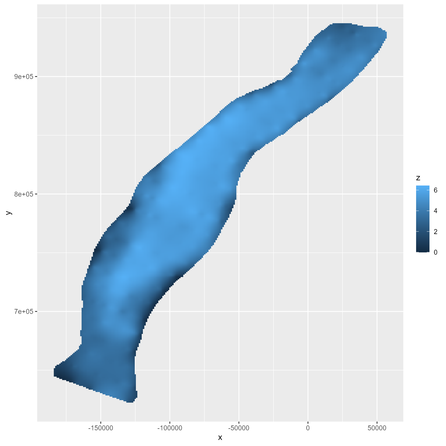
Of course, a basemap and a useful color scheme would really help
here. Making a basemap requires one additional step, in comparison to
the above examples with stickplots: because of current limitations in
how some of these functions are written, you must provide an
sf object to the get_basemap_layers
function:
# create an sf object we can use to define the basemap extent
extent <- st_as_sf(interp_vals_2021, coords = c("x", "y"), crs = "EPSG:3338")

# use this to return the basemap; return a simple basemap with contours as the bathymetery seems too busy with interpolated maps
basemap <- get_basemap_layers(plot_limits_data = extent, bathy = FALSE, contours = c(100, 200, 1000))
Once you’ve got a basemap, you can add your raster (here, with a slightly upgraded color scheme):
basemap +
  geom_raster(data = interp_vals_2021, aes(x = x, y = y, fill = z)) +
  scale_fill_viridis_c(option = "magma")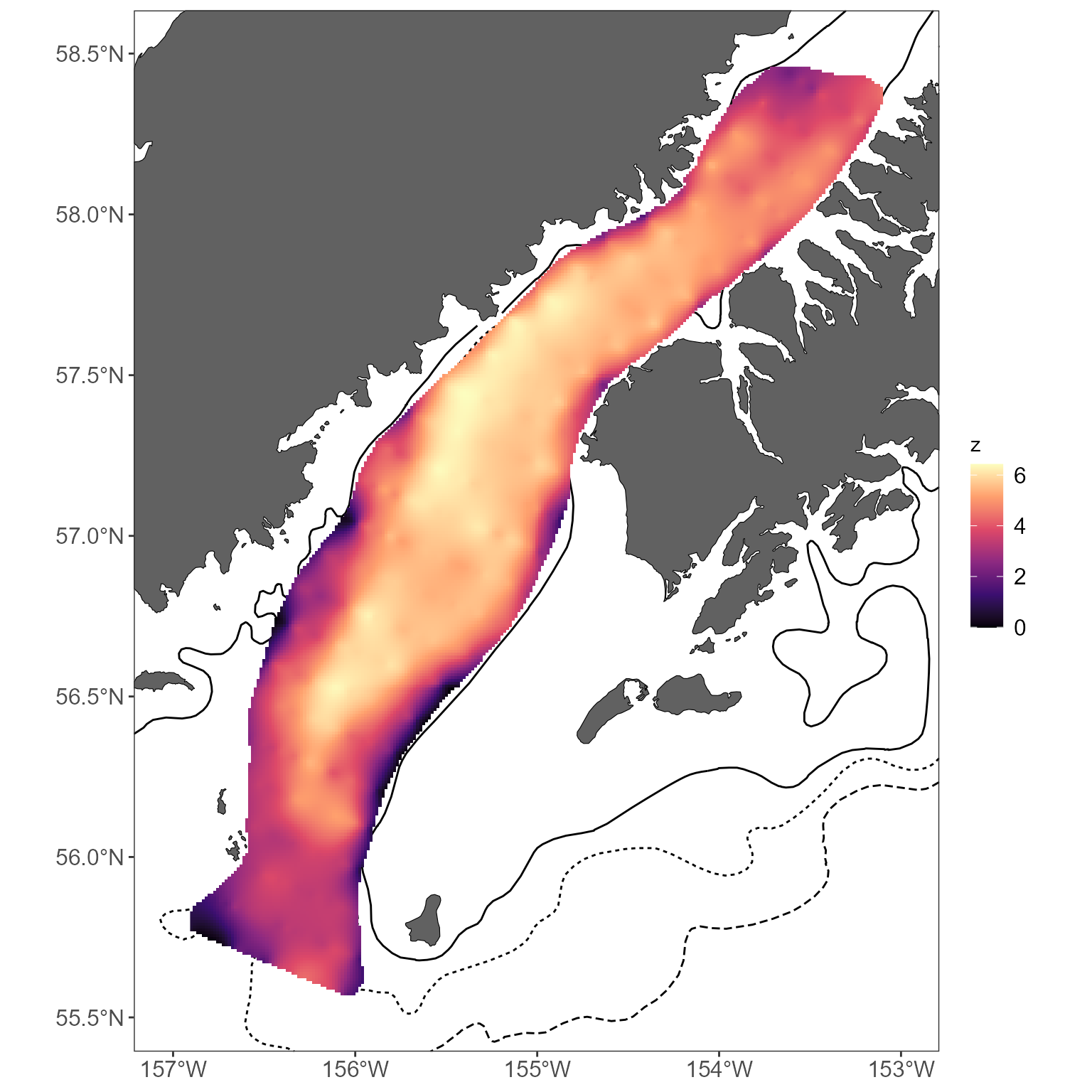
There is an additional function
get_interpolated_color_bins to bin colors and make trends
easier to see. At a minimum, you have to specify the z value:
interp_vals_2021$plot_col <- get_interpolated_color_bins(z = interp_vals_2021$z)

basemap +
  geom_raster(data = interp_vals_2021, aes(x = x, y = y, fill = plot_col)) +
  scale_fill_viridis_d(option = "magma")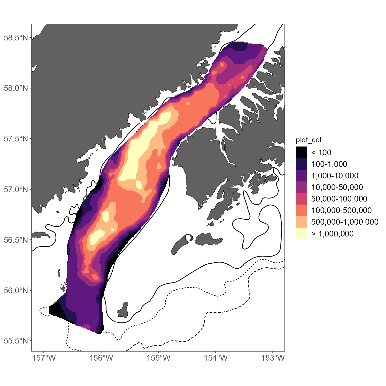
By default, this returns log10-sized bins; this can be modified using
the style argument to
get_interpolated_color_bins. See
?get_interpolated_color_bins for options, but
kmeans tends to work well.
If you want to interpolate and compare over multiple years, things get a bit more complex. The approach outlined above- which uses a local neighborhood to speed up plotting- isn’t as great when comparing across years. This is because we constrain the extrapolations to areas with nearby samples when using a local neighborhood. If your sample grid changes between years, the area of your extrapolation will also change. This can be avoided by not using a local neighborhood. It slows things down, but makes datasets more easily comparable.
# summarize example data: biomass per interval, per year
shelikof_by_year <- shelikof_biomass %>%
group_by(year, INTERVAL, START_LATITUDE, START_LONGITUDE) %>%
summarize(BIOMASS = sum(BIOMASS))
# loop through each year to return each year's values:
interp_by_year <- c()
for (i in unique(shelikof_by_year$year)) {
# limit your dataset to one year
tmp_data <- shelikof_by_year[shelikof_by_year$year == i, ]
# get the interpolations for this year: note that no neighborhood is applied
interp_vals <- get_interpolated_plot_vals(x = tmp_data$START_LONGITUDE, y = tmp_data$START_LATITUDE, z = tmp_data$BIOMASS, resolution = 1000, region = "shelikof", interp_type = "universal")
# add a year index
interp_vals$year <- i
# and compile
interp_by_year <- rbind(interp_by_year, interp_vals)
}
#> [1] "Interpolating using universal kridging; this can be very slow! Consider a higher resolution value if this is taking forever (recommended resolution for summer surveys >= 2500; for winter >= 1000)."
#> [1] "Interpolating using universal kridging; this can be very slow! Consider a higher resolution value if this is taking forever (recommended resolution for summer surveys >= 2500; for winter >= 1000)."
# create an sf object we can use to define the basemap extent
extent <- st_as_sf(interp_by_year, coords = c("x", "y"), crs = "EPSG:3338")
# use this to return the basemap; return a simple basemap with contours as the bathymetery seems too busy with interpolated maps
basemap <- get_basemap_layers(plot_limits_data = extent, bathy = FALSE, contours = c(100, 200, 1000))
# bin colors to highlight patterns
interp_by_year$plot_col <- get_interpolated_color_bins(z = interp_by_year$z)
# use ggplot to plot, facet plots by year
basemap +
geom_raster(data = interp_by_year, aes(x = x, y = y, fill = plot_col)) +
scale_fill_viridis_d(option = "magma") +
facet_wrap(~year, ncol = 2) +
labs(fill = "Biomass (kg)") +
theme(legend.position = "bottom")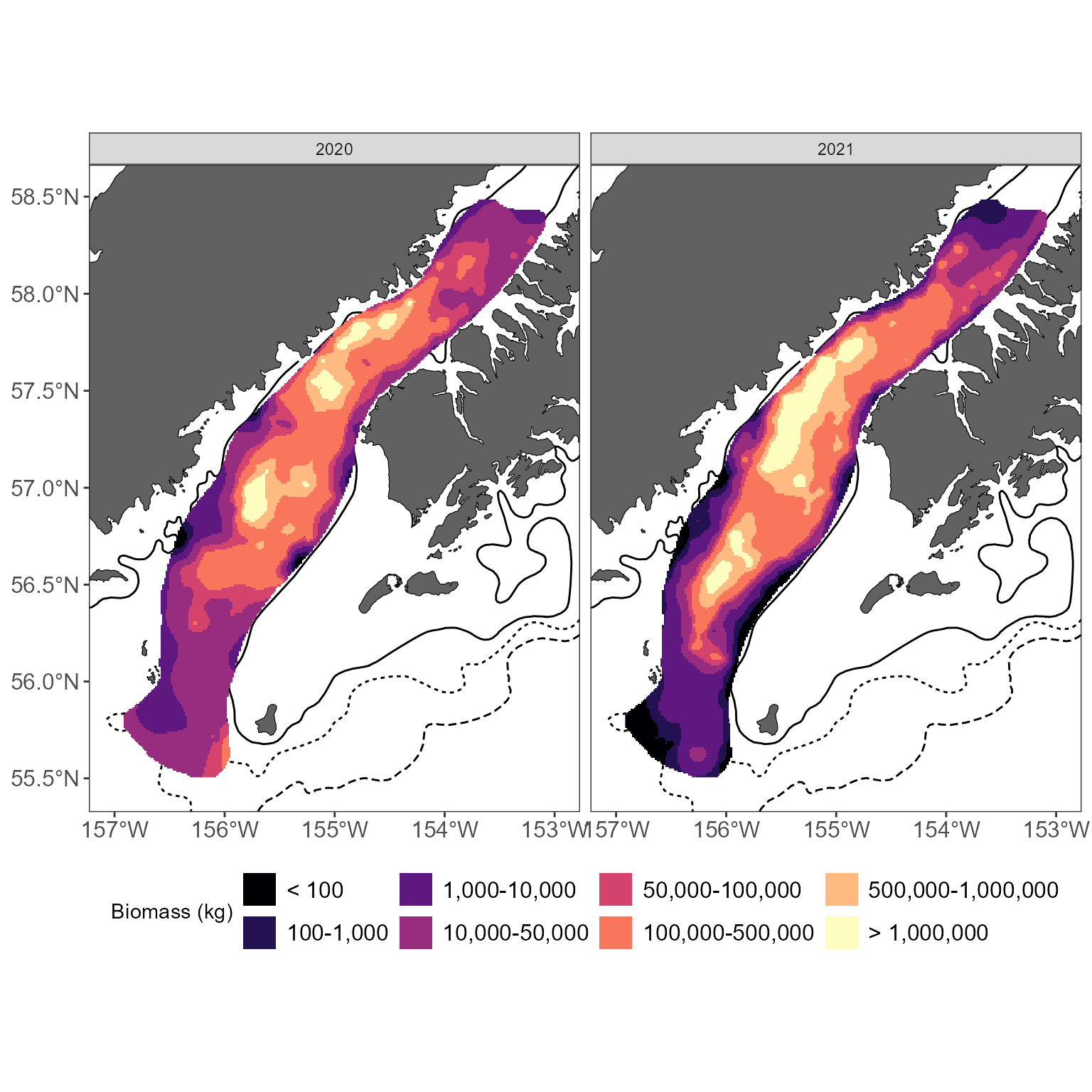 Water temperatures and interpolations
If you want to interpolate water temperature values instead of fish abundance values, there are some modifications to make a more logical interpolation. Namely, you’ll probably want to interpolate values in the linear domain (as opposed to the default interpolations which work with log10-transformed values). Linear interpolations are possible using simple kriging and inverse-distance weighting in MACEReports. In this example, sea surface temperatures collected during a Shelikof winter survey are used to create an interpolated map using simple kriging:
# get interpolated sea surface temperatures using simple kriging of linear values:
interp_temps <- get_interpolated_plot_vals(x = shelikof_sst$LONGITUDE, y = shelikof_sst$LATITUDE, z = shelikof_sst$MEASUREMENT_VALUE, resolution = 1000, region = "shelikof", interp_type = "simple", interp_scale = "linear", neighborhood = 200)
#> [1] "Interpolating using simple kriging; this can be very slow! Consider a higher resolution value if this is taking forever (recommended resolution for summer surveys >= 2500; for winter >= 1000"
#> [using simple kriging]

# create an sf object we can use to define the basemap extent
extent <- st_as_sf(interp_temps, coords = c("x", "y"), crs = "EPSG:3338")

# use this to return the basemap; return a simple basemap with contours as the bathymetery seems too busy with interpolated maps
basemap <- get_basemap_layers(plot_limits_data = extent, bathy = FALSE, contours = c(100, 200, 1000))

# use ggplot to plot
basemap +
  geom_raster(data = interp_temps, aes(x = x, y = y, fill = z)) +
  scale_fill_distiller(palette = "RdYlBu", direction = -1) +
  labs(fill = "Temperature (C)")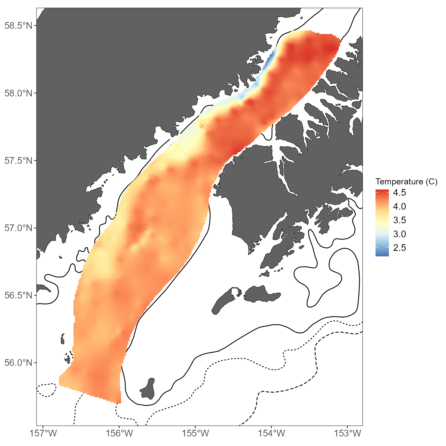
Accessing common MACE shapefiles
Many shapefiles that we commonly use here are stored within
MACEReports. This can be handy if you don’t want to use the
ggplot-flavored basemaps generated by get_basemap_layers,
for example. It can also be nice to have more flexibility in creating
your own figures. This is meant to be more convenient than calling out
to mapping directories all over the place. If you’ve got a shapefile
that should be included, let us know and we’ll include it. There are
functions to see what is currently available, and to load them into your
script:
# check out what is available:
available_shapefiles()
#> [1] "alaska_3nmi_buffer"
#> [1] "alaska_area_labels.gpkg"
#> [1] "alaska_bathy_contours"
#> [1] "alaska_bathy_raster"
#> [1] "alaska_land"
#> [1] "alaska_NMFS_management_regions"
#> [1] "alaska_race_bathy"
#> [1] "bearded_seal_critical_habitat"
#> [1] "canada_land"
#> [1] "ci_beluga"
#> [1] "core_ebs_extrp_polygon"
#> [1] "goa_summer_extrap_polygon"
#> [1] "humpback_whale_dps_critical_habitat_2021"
#> [1] "nprw_critical_habitat"
#> [1] "NWR_Afognak_Semidi"
#> [1] "ringed_seal_critical_habitat"
#> [1] "russia_land"
#> [1] "sca_extrp_polygon"
#> [1] "sea_otter_critical_habitat"
#> [1] "shelikof_extrap_polygon"
#> [1] "SSL_critical_habitat"
#> [1] "SSL_no_transit"
#> [1] "walrus_no_transit"
#> [1] "walrus_protection_area"
# get a file
ak_management_areas <- get_shapefile(shapefile_name = "alaska_NMFS_management_regions")

# note that this will, by default, return a file projected Albers Equal Area Alaska (EPSG:3338). If you'd prefer something else, select a valid CRS for the crs argument:
ak_management_areas <- get_shapefile(shapefile_name = "alaska_NMFS_management_regions", crs = "EPSG:4326")
More bathymetery options
Maybe you’d like even more control over what bathymetry you display-
say, different line types or colors for each depth. We’ve got two
functions to make this pretty straightforward:
get_shapefile and easy_plot_limits.
easy_plot_limits is just a little convenience function for
maps with ggplot so you don’t have to deal with setting limits based on
coordinates.
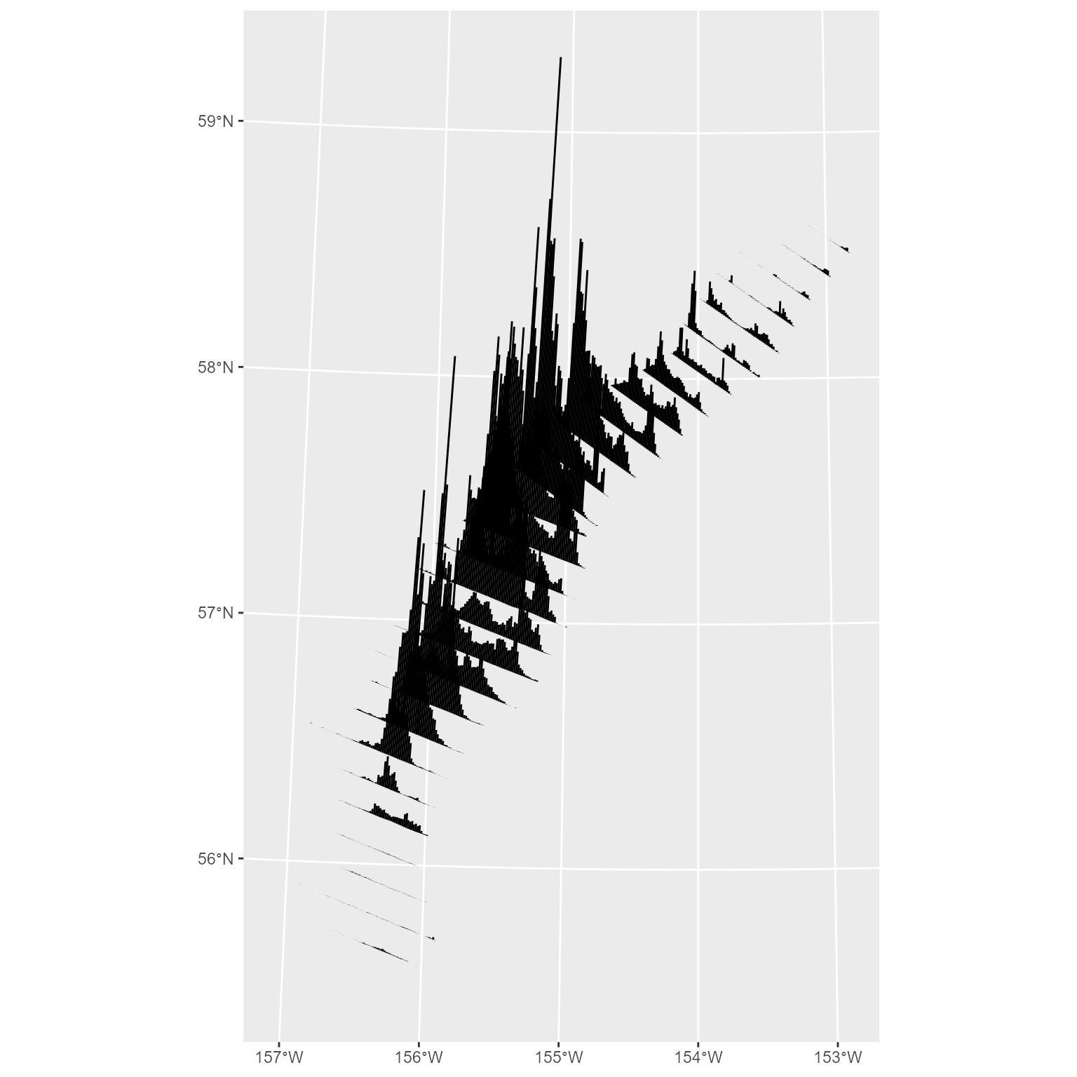
# first, go get the 50,100, and 200 m bathymetric lines
bathy_lines <- get_shapefile(shapefile_name = 'alaska_bathy_contours') %>%
  filter(METERS %in% c(50,100,200))

# get a basemap based on the shelikof stickplots, but leave out the bathymetry
basemap <- get_basemap_layers(plot_limits_data = sticks, bathy = FALSE)

# now go add your sticks, and the custom bathymetry
basemap +
  # add the bathy lines with different linetypes for each depth
  geom_sf(data = bathy_lines, aes(color = factor(METERS))) +
  labs(color = 'Depth (m)') +
  # add some data
  geom_sf(data = sticks, color = 'red') +
  # use the easy_plot_limits function to handle the limits!
  # just feed it the same sf object that you used for your basemap.
  # this is required when you bring in a new shapefile that has a greater extent than the basemap
  # (in this case, bathy_lines)
  easy_plot_limits(plot_limits_data = sticks)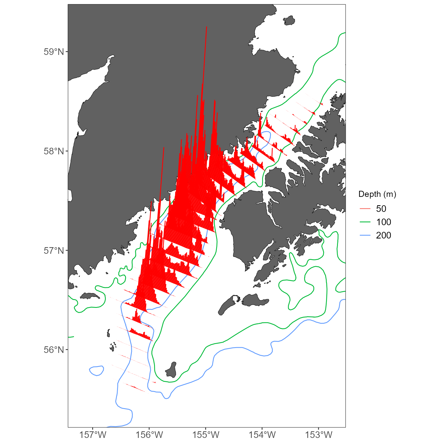
Or, maybe you want the bathymetric lines to be plotted on top of an another layer:
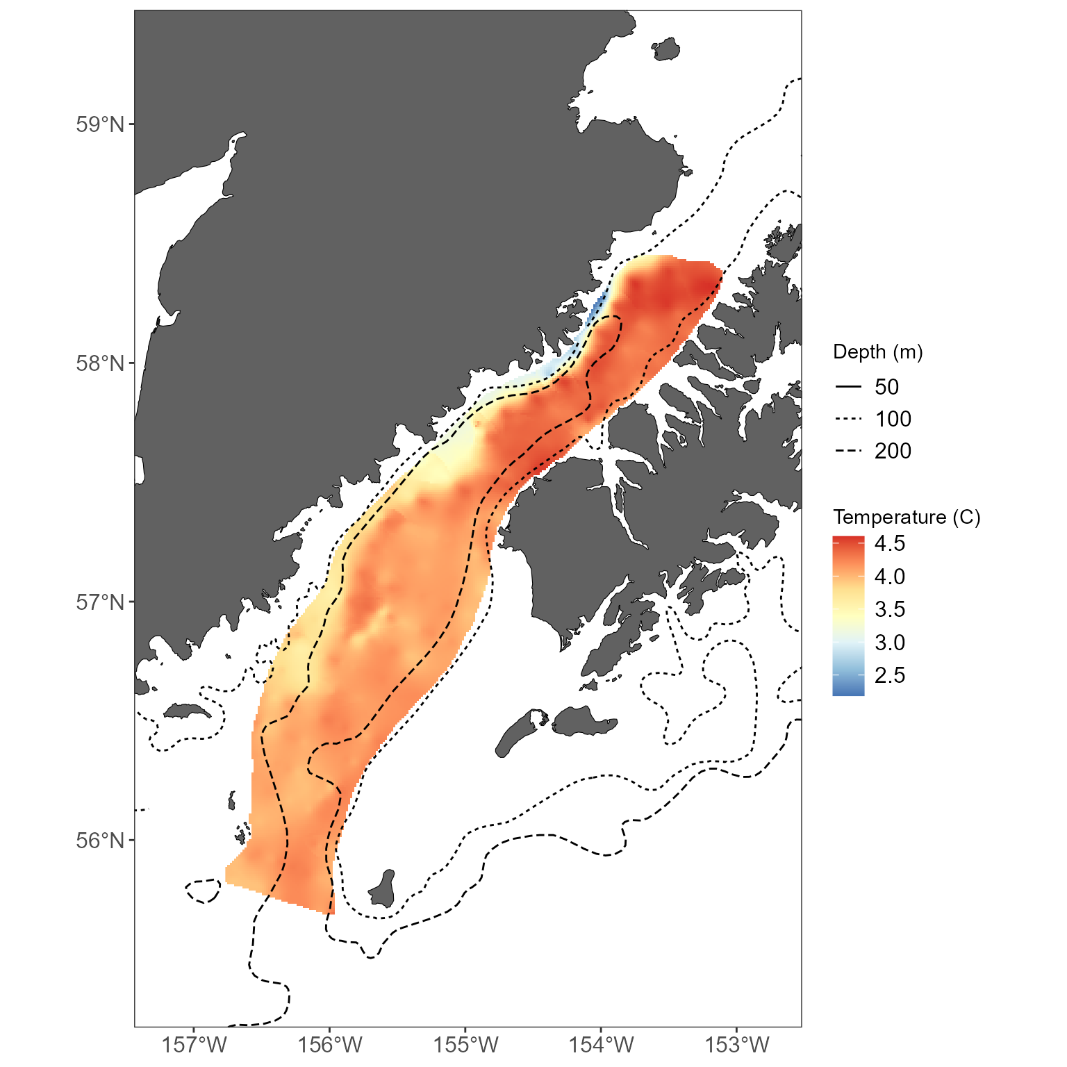
# plot that temperature with interpolated layer below the bathymetry
basemap +
  geom_raster(data = interp_temps, aes(x = x, y = y, fill = z)) +
  scale_fill_distiller(palette = "RdYlBu", direction = -1) +
  labs(fill = "Temperature (C)") +
  # add the bathy lines with different linetypes for each depth
  geom_sf(data = bathy_lines, aes(linetype = factor(METERS))) +
  labs(linetype = 'Depth (m)') +
  # use the easy_plot_limits function to handle the limits!
  # just feed it the same sf object that you used for your basemap.
  # this is required when you bring in a new shapefile that has a greater extent than the basemap
  # (in this case, bathy_lines)
  easy_plot_limits(plot_limits_data = sticks)